BRAND STANDARDS GUIDE
Use this guide to ensure our brand is represented consistently and professionally in every medium, from print to digital.
Effective: September 10, 2026
Use this guide to ensure our brand is represented consistently and professionally in every medium, from print to digital.
Effective: September 10, 2026
The Westminster Catawba Christian School brand reflects who we are: a grace-filled community committed to educating students to bless our world as disciples of Jesus Christ. This guide provides the standards needed to represent WCCS clearly and consistently across print and digital communications. By using our logos, colors, typography, and voice with care, we strengthen recognition, build trust, and communicate our shared purpose: helping students become Rooted in Christ and Prepared for Purpose.
✅ Use the correct logo variation for the background (full color, reverse/white, grayscale)
✅ Keep a clear space around the logo, following buffer zone guidelines
✅ Respect minimum size requirements for legibility
✅ Use approved brand colors and fonts only
✅ Include the tagline when appropriate; omit it when space or legibility is limited
❌ Don’t stretch, recolor, rearrange, or modify the logo or tagline

For more than 30 years, Westminster Catawba Christian School has partnered with families to provide an excellent, distinctly Christian education in Rock Hill, South Carolina. As a ministry of Westminster Presbyterian Church, WCCS was established with a clear mission: to educate students to bless our world as disciples of Jesus Christ.
Today, WCCS serves students from Early Childhood through High School across two campuses. While the school has grown, its purpose remains steadfast — to nurture students in mind, body, and spirit, help them develop their God-given gifts, and prepare them to serve wherever God leads.
“Rooted in Christ. Prepared for Purpose.”
As Westminster Catawba Christian School has grown across two campuses and expanded its programs from infancy through 12th grade, its visual identity has evolved to reflect the full WCCS experience. The refreshed brand brings greater consistency to academic and athletic communications while honoring the school’s established heritage and Christ-centered mission.
The WCCS brand represents a school community united by faith and purpose. Our academic identity conveys excellence and tradition, while our athletic identity expresses strength and school spirit. Together, they communicate one shared promise: that we are a place where students are known, loved, and prepared.

The WCCS voice reflects a grace-filled, Christ-centered community that values biblical truth, partnership, and the whole child. Our communication should be warm, clear, and purposeful, helping families feel welcomed and understood while expressing confidence in our mission and educational approach.
Our communication should adapt to who we’re addressing while maintaining a consistent brand personality:
Consistent use of color strengthens the WCCS identity and makes Westminster Catawba Christian School instantly recognizable. Follow the approved color specifications to maintain accuracy and consistency across all print and digital applications.
GOLD
–
PANTONE 4515
CMYK 13, 19, 62, 28
RGB 179, 163, 105
HEX #B3A369
NAVY
–
PANTONE 281
CMYK 100, 85, 5, 36
RGB 0, 32, 91
HEX #00205B
SKY
–
PANTONE 644
CMYK 42, 10, 2, 6
RGB 155, 184, 211
HEX #9BB8D3
SLATE
–
PANTONE 281 @ 20% Tint
CMYK 20, 17, 1, 7
RGB 204, 210, 222
HEX #CCD2DE
CREAM
–
PANTONE 4515 @ 8% Tint
CMYK 1, 2, 5, 2
RGB 250, 250, 245
HEX #FAFAF5
Typography plays a key role in expressing the Westminster Catawba Christian School brand. Our logo uses specific typefaces, and all supporting communications, from print materials to digital content, should follow the approved font guidelines.
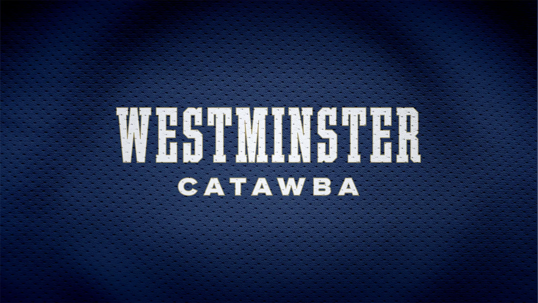
The WCCS typography system includes distinct typefaces for academic and athletic communications. Academic materials use Gambetta Variable, primarily in Regular weight, for headlines and Proxima Nova Wide for subheads and general use. Athletic materials use VT Foundry Slab for headlines and uniforms, paired with Proxima Nova Wide for general use.

Use: General. For subtitles, set to all-caps with subtle tracking between letters.
Available for purchase from Mark Simonson Studio or on Adobe Fonts

Use: Primary Headlines, Display Titles, Spiritwear, and Uniforms / Jerseys.
Available for purchase from varsitytype.com
Use: General. For subtitles, set to all-caps with subtle tracking between letters.
Available for purchase from Mark Simonson Studio or on Adobe Fonts
When the primary WCCS typefaces are unavailable, use these accessible supporting fonts to maintain a consistent look across print and digital communications.
EB Garamond
Use: Academic Primary Headlines, Display Titles, and Small Captions.
Available at fonts.google.com
Montserrat
Use: General. For subtitles, set to all-caps with subtle letter spacing.
Available at fonts.google.com

Use: Athletic Primary Headlines, Display Titles, Spiritwear, and Uniforms / Jerseys.
Best utilized with tight letter spacing (-5%).
Available at fontsquirrel.com
Our logos are a visual representation of the WCCS identity. Using them consistently builds recognition and trust. Follow these guidelines to ensure logos are applied correctly across all materials.
The academic brand may be used in approved Gold and Navy, Gold and Cream, all-Gold, all-Navy, all-Cream, Black, or White variations. The Gold WC monogram and wordmark should serve as the primary version to strengthen brand recognition. Choose an alternate variation when the background or production method requires greater contrast.






The tagline should be used when there is space and time for the audience to read it:
• Use the tagline in print and web materials targeting audiences unfamiliar with the brand
• Do not use the tagline when space is limited, legibility is a concern, or on small apparel items
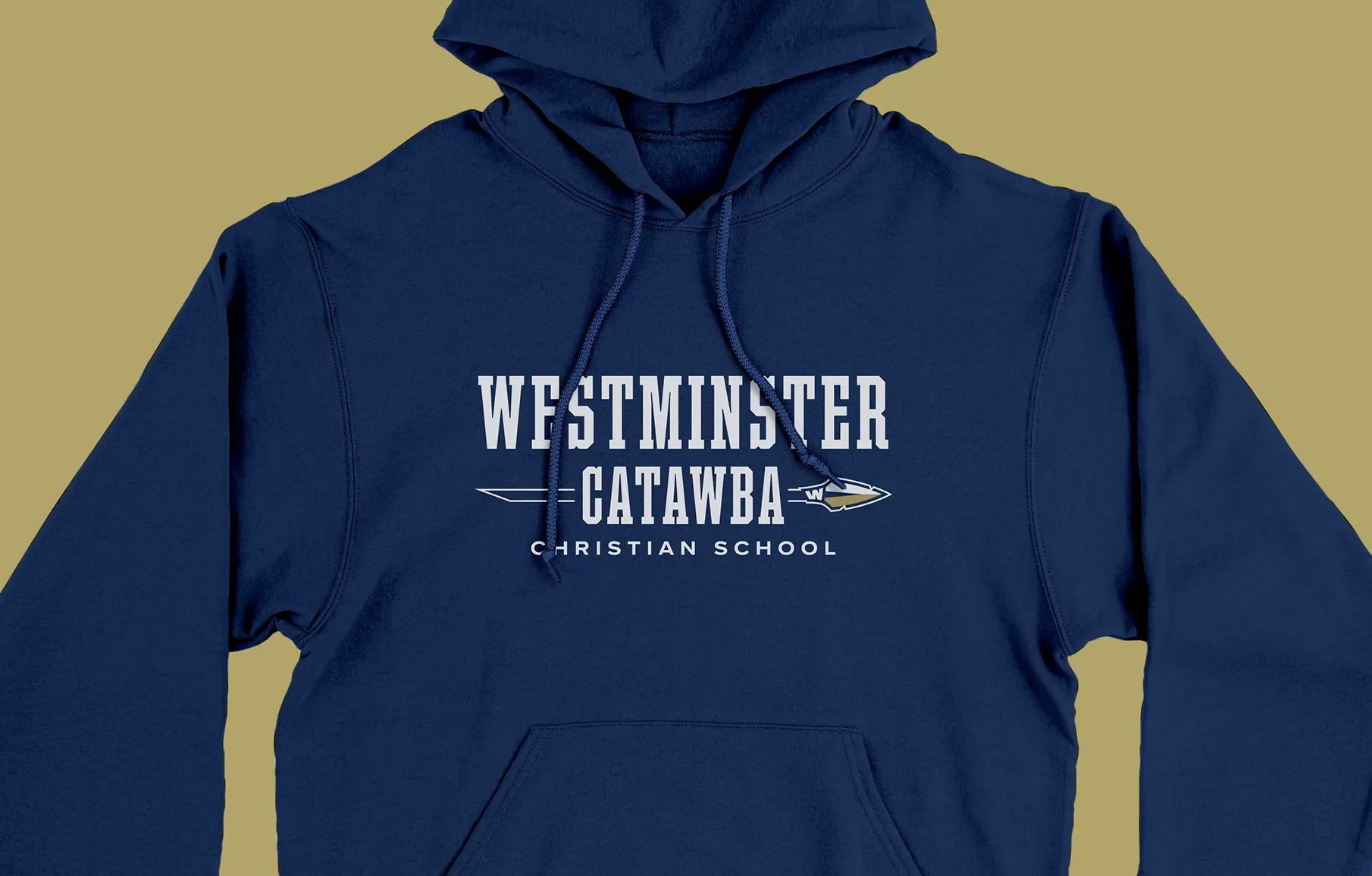
Use Navy, White, and Gold together as the primary athletic color treatment. The athletic logo is the primary version and should be used for nearly all athletic applications. Only use “Knockout” variations when applying the logo to a solid, pre-approved brand color with correct contrast and color combination. Black or White variations should be reserved for situations where production limitations or background contrast make the three-color version impractical.




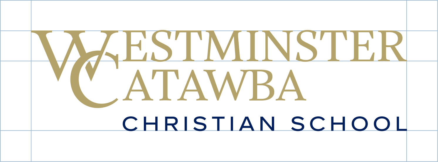
Maintain a minimum clear space equal to the font’s cap height in “estminster” from the logo’s text. This space must remain free of text, graphics, or other visual elements. The buffer zone ensures the logo stands out and is not visually crowded.
Because the interlocking WC monogram contains natural open space in its lower-left area, center it optically rather than mathematically within social media profile images and other tightly enclosed shapes. Adjust its position until it appears visually balanced.
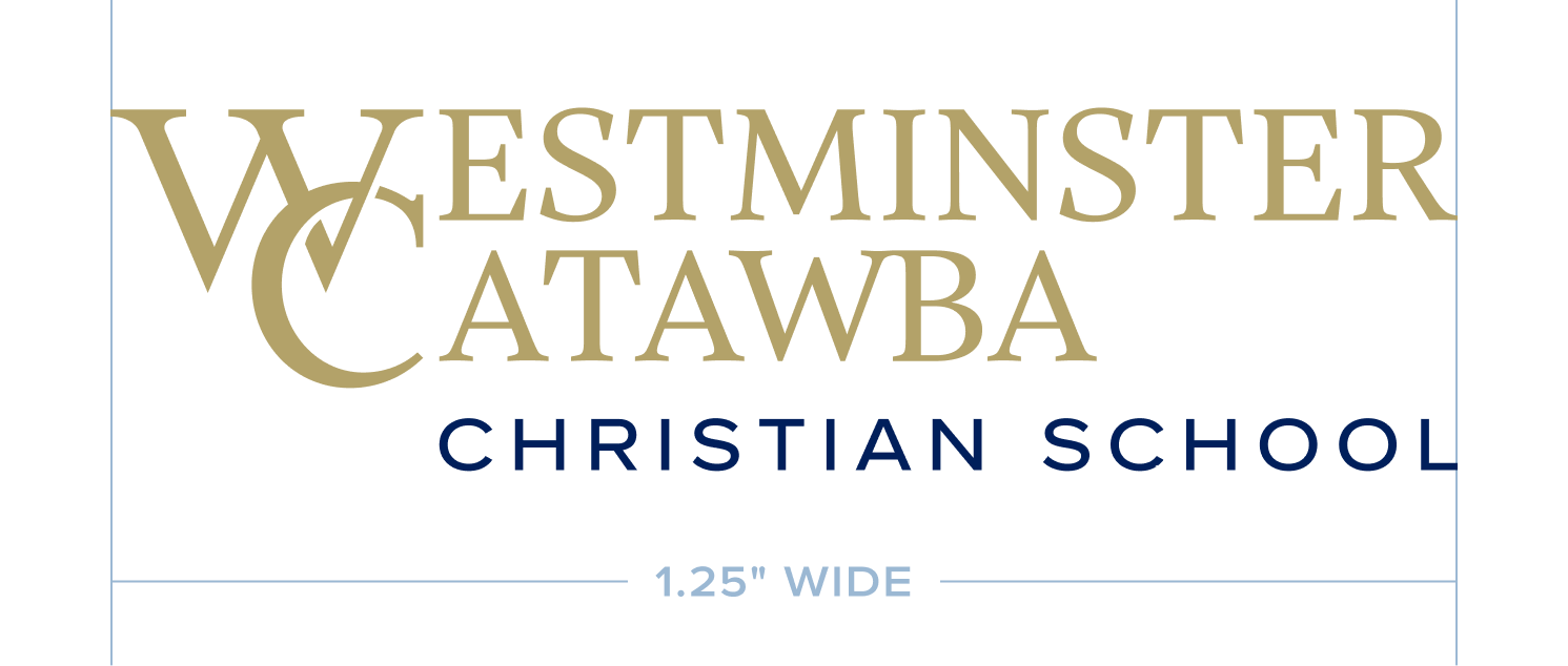
To ensure legibility, all logos must be reproduced at no smaller than 1.25 inches wide, measured from the widest point of the logo. This applies to both print and digital uses.
Consistent application of the WCCS brand builds recognition and reinforces trust. When applied correctly, our logos, colors, and typography create a cohesive visual identity across all touchpoints.
Official WCCS logos are available by request. To obtain the appropriate logo files, please contact Jennifer Polston, Communications Coordinator, at jpolston@wccs.org. Use the correct files to ensure color accuracy, proper scaling, and consistent branding.
Use the academic logo “WCCS-Academic-Logo_Gold-Navy” for school-wide and academic purposes, and the athletic logo “WCCS – Athletic-Monogram-wSpear_3-Color” for sports-related materials.
Include the tagline when space allows and when the audience is unfamiliar with the school. Avoid using it on small items or when legibility is an issue.
No. Always use the approved brand colors exactly as listed in this guide.
See the Support section below for contact details.
For questions about the Westminster Catawba Christian School brand or help selecting the correct files, contact Jennifer Polston, Communications Coordinator, at jpolston@wccs.org.
