BRAND STANDARDS GUIDE
Use this guide to ensure our brand is represented consistently and professionally in every medium, from print to digital.
Effective: January 8, 2026
Use this guide to ensure our brand is represented consistently and professionally in every medium, from print to digital.
Effective: January 8, 2026
The FaithRidge Christian School brand embodies the heart of our school, conveying our mission, vision, and foundation in Christ-centered education. This guide provides practical tools for applying the brand clearly and consistently across all platforms, from printed materials and digital communications to signage, uniforms, and merchandise.
Use this guide as a reference whenever representing FaithRidge visually. Consistent application strengthens recognition, builds trust, and supports the school’s mission in every interaction.
✅ Use the correct logo variation for the background (full color, reverse/white, grayscale)
✅ Keep a clear space around the logo, following buffer zone guidelines
✅ Respect minimum size requirements for legibility
✅ Use approved brand colors and fonts only
✅ Include the tagline when appropriate; omit it when space or legibility is limited
❌ Don’t stretch, recolor, rearrange, or modify the logo or tagline
Need the files now? Scroll down to Download Assets for organized academic and athletic logo packages in multiple formats, along with guidance on when to use each.
The voice of FaithRidge Christian School reflects its identity as a Christ-centered, mission-driven, and community-rooted institution. Every written and spoken message should carry the clarity that defines our school’s approach to education.
Tone may shift depending on the audience, while staying true to the school’s foundation:
“FaithRidge Christian School is passionate about cultivating the next generation to impact the world for God’s glory. We are committed to doing everything we can to teach, train, and exemplify what it means to be an authentic Christian pursuing His purpose for each of our lives. We can’t wait to see what God has in store for the future of FaithRidge and each of our students.”
Consistent use of the approved palette helps the FaithRidge brand remain recognizable and unified across all materials, from academic documents and digital platforms to athletic uniforms and signage.
Use these exact color values in all print and digital applications. Do not substitute or modify without approval.
PANTONE 7409
CMYK 0, 31, 100, 0
RGB 253, 183, 20
HEX #FDB714
PANTONE 2756
CMYK 100, 98, 0, 15
RGB 38, 42, 130
HEX #262A82
PANTONE 306
CMYK 75, 0, 5, 0
RGB 0, 188, 231
HEX #00BCE7
PANTONE 129
CMYK 0, 11, 78,0
RGB 255, 221, 85
HEX #FFDD55
PANTONE 7685
CMYK 95, 69, 0, 0
RGB 1, 92, 171
HEX #015CAB
PANTONE 427
CMYK 7, 3, 5, 8
RGB 216, 220, 219
HEX #D8DCDB
PANTONE 427 at 75%
RGB 226, 229, 228
HEX #E2E5E4
PANTONE 427 at 50%
RGB 235, 237, 237
HEX #EBEDED
PANTONE 427 at 25%
RGB 245, 246, 246
HEX #F5F6F6
Typography shapes how the FaithRidge Christian School brand is read, both visually and tonally. These font families were selected to reflect clarity, structure, and approachability across academic and athletic materials.
Use only the approved fonts listed below. All fonts are open-source and can be accessed through Google Fonts and Fontshare.
ROBOTO CONDENSED
Use: Dense layouts, sub-navigation, sidebars, and compact copy needs-action
Available at fonts.google.com
RED HAT DISPLAY
Use: Subtext in designs, wordmark pairings, secondary text on uniforms
Available at fonts.google.com
Font sizing and weight should be tested across merchandise, signage, and uniforms to ensure readability at a distance and under varied lighting conditions.
The FaithRidge Christian School logos are key identifiers for the academic and athletic brands. Each version has been designed for clarity, adaptability, and visual balance across different media.
Use only approved logo files. Do not recreate or modify the logos in any form.
The academic brand may be used in two-color, blue, black, or white. Choose the logo variation that provides the best contrast with its background.
The tagline should be used when there is space and time for the audience to read it:
• Use the tagline in print and web materials targeting audiences unfamiliar with the brand
• Do not use the tagline when space is limited, legibility is a concern, or on small apparel items
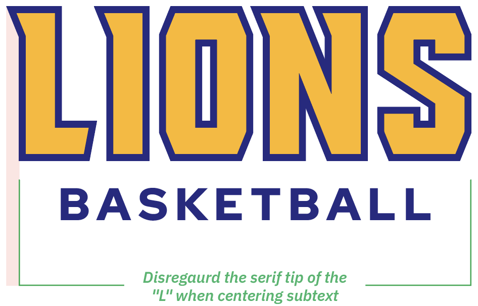
The athletic brand may be used in full-color, black, or white.


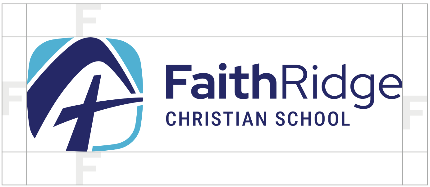
Use the size of the “F” in FaithRidge to give minimum spacing on the horizontal and vertical axis. This space must remain free of any other text, graphics, or design elements. A buffer zone applies to all logo versions, whether used with or without the tagline.

To ensure legibility in printing, all logos must be reproduced at no smaller than .5 inches tall. For digital applications, ensure that logos will be legible when down scaling.
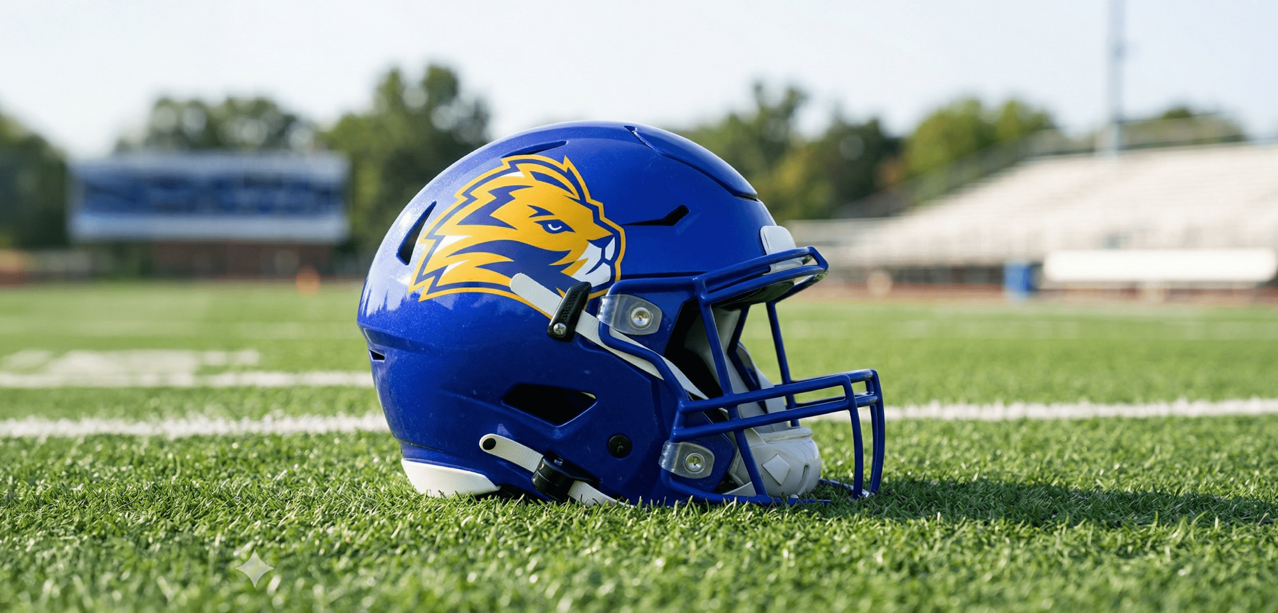
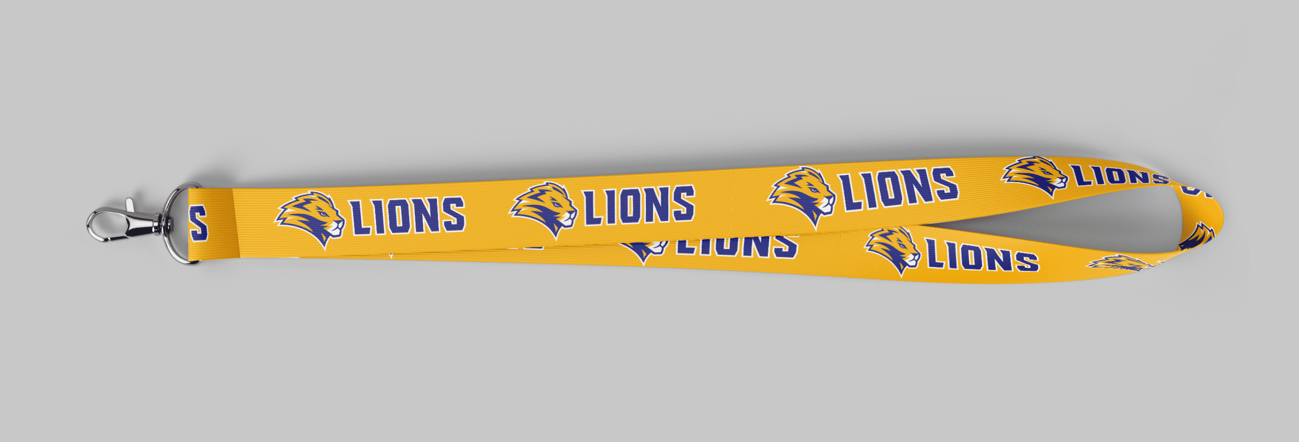


Use the academic logo for school-wide and academic purposes, and the athletic logo for sports-related materials.
Include the tagline when space allows and when the audience is unfamiliar with the school. Avoid using it on small items or when legibility is an issue.
No. Always use the approved brand colors exactly as listed in this guide.
For questions about the FaithRidge Christian School brand or help selecting the correct files, contact:
Janet Swartz
Business Manager & Admissions Coordinator
jswartz@ozaukeechristian.org