Use this guide to ensure our brand is represented consistently and professionally in every medium, from print to digital.
Effective: March 18, 2026
This Digital Brand Standards Guide is designed to help every member of the Woodcrest Christian School community communicate with consistency and purpose. At Woodcrest Christian, our identity is rooted in a shared mission and expressed through every message we send and every visual we create. This guide ensures that whether we’re speaking to prospective families, current students, alumni, or the broader community, we present a unified voice that reflects who we are — strong in faith, committed to academic excellence, and focused on preparing students for bold futures.
By following these standards, we strengthen recognition, build trust, and ensure that every touchpoint reflects the excellence and Christ-centered foundation that define Woodcrest Christian.

Our Story
Since its founding in 1948, Woodcrest Christian School has been committed to providing a Christ-centered education that shapes both the mind and the heart. What began as a small educational ministry has grown into a thriving school serving students from transitional kindergarten through high school.
Over the decades, Woodcrest Christian has expanded in both scope and impact — adding new grade levels, developing a second campus, and strengthening its college-preparatory programs. Yet through every season of growth, one thing has remained constant: a deep commitment to nurturing students in faith, equipping them with wisdom, and preparing them to live out their God-given purpose in the world.
MISSION
Glorify God by Pursuing Excellence in Christ-centered Academics.
VISION
Passionately Preparing Students to Impact the World for Christ
TAGLINE
Strong faith. Sharp minds. Bold futures.
The Evolution of Our Brand
As Woodcrest Christian School has grown, so has the way we communicate who we are.
From its early days as a small Christian school to a thriving TK–12 academic community, Woodcrest Christian has continually expanded its programs, campuses, and reach. Along the way, the brand has matured — becoming more defined and more intentional in how it reflects the school’s mission and values.

What Our Brand Represents Today
Today, the Woodcrest Christian School brand reflects a community grounded in faith, where students are known, supported, and challenged to grow. It communicates a standard of excellence in academics, while also emphasizing character, leadership, and spiritual formation.
Above all, the brand embodies a clear and compelling promise: students will graduate with strong faith, sharpened minds, and the courage to pursue bold futures. Every message, visual, and interaction should reinforce this identity — ensuring that Woodcrest Christian is recognized not only for what it offers, but for who it develops.
The voice of Woodcrest Christian School is grounded, confident, and encouraging. It reflects a community that speaks with purpose, where communication feels thoughtful and authentic. Our voice should be approachable without being casual, professional without feeling distant, and expressive without becoming overly promotional.
We communicate in a way that builds trust. Every message should feel intentional, consistent, and aligned with who we are, ensuring that whether someone is new to Woodcrest Christian or deeply connected to the community, the experience of our voice remains clear and recognizable.
Our communication should adapt to who we’re addressing while maintaining a consistent brand personality:
Consistent use of the approved palette helps the Woodcrest Christian brand remain recognizable and unified across all materials, from academic documents and digital platforms to athletic uniforms and signage.
Use these exact color values in all print and digital applications. Do not substitute or modify without approval.
PANTONE 2685 C
CMYK 89, 100, 21, 9
RGB 51, 0, 114
HEX #452974
PANTONE 7549 C
CMYK 5, 30, 100, 0
RGB 242, 179, 0
HEX #F1B51C
PANTONE 5315 C
CMYK 13, 11, 6, 0
RGB 218, 217, 225
HEX #DAD9E0
Typography shapes how the Woodcrest Christian School brand is read, both visually and tonally. These font families were selected to reflect clarity, structure, and approachability across academic and athletic materials.
Use only the approved fonts listed below. All fonts are open-source and can be accessed through Google Fonts and Fontshare.
MONSERRAT BOLD
Available at fonts.google.com
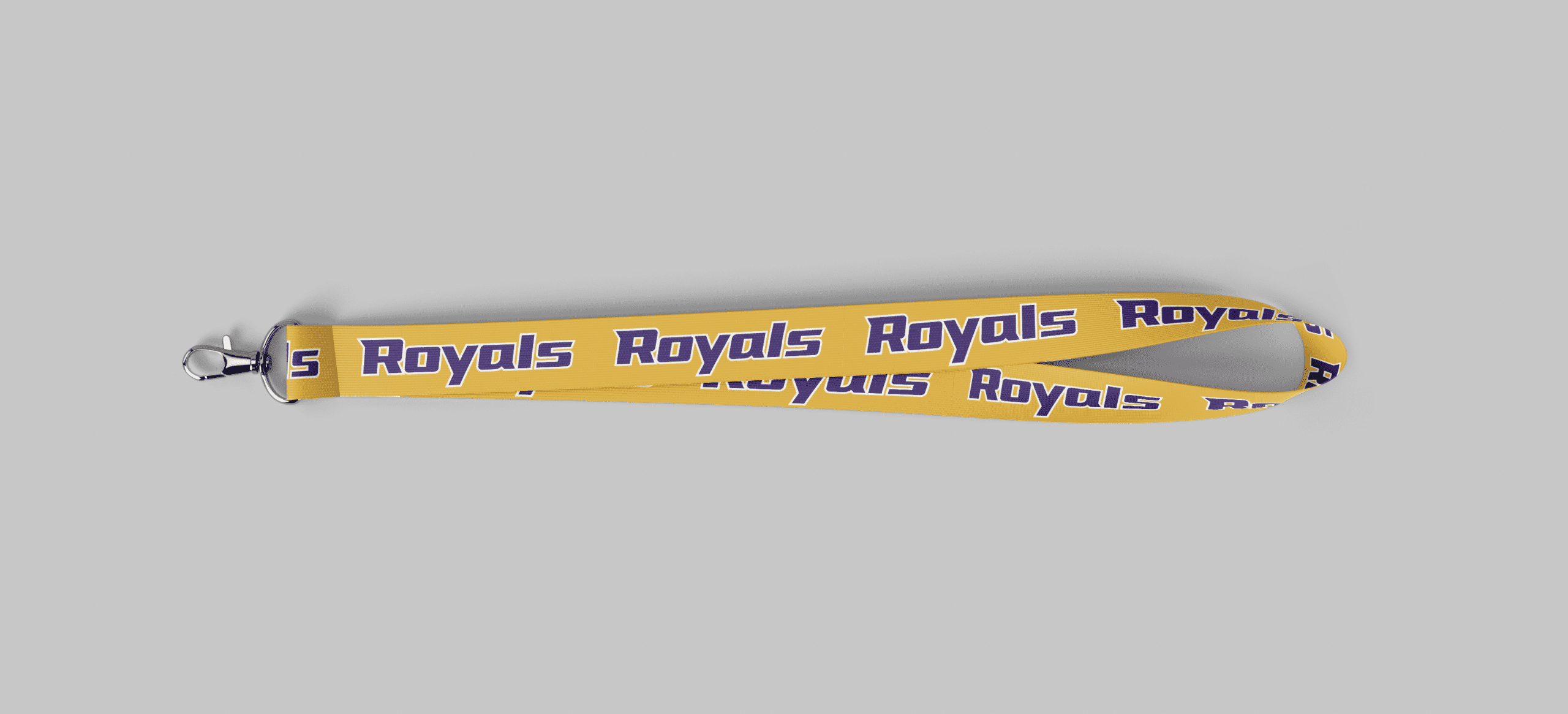
Font sizing and weight should be tested across merchandise, signage, and uniforms to ensure readability at a distance and under varied lighting conditions.
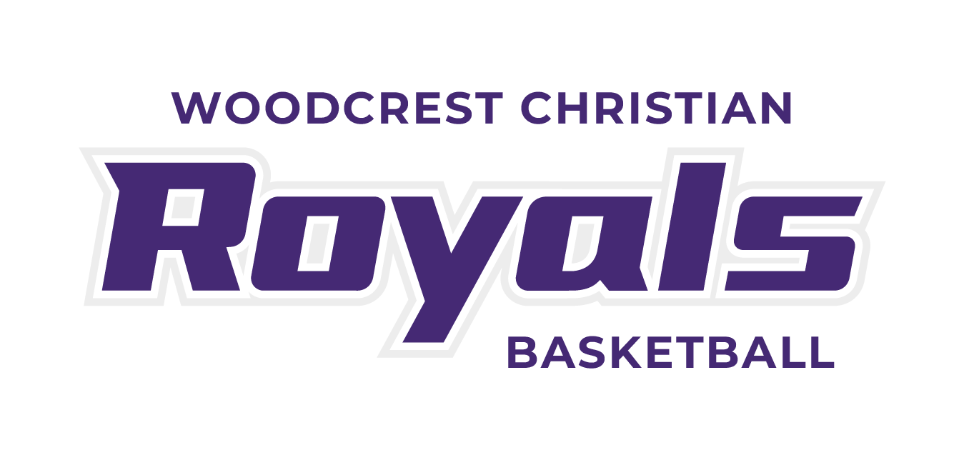
The Woodcrest Christian School logos are key identifiers for the academic and athletic brands. Each version has been designed for clarity, adaptability, and visual balance across different media.
Use only approved logo files. Do not recreate or modify the logos in any form.
The academic brand may be used in full-color, black, or white. Choose the logo variation that provides the best contrast with its background.

The tagline should be used when there is space and time for the audience to read it:
• Use the tagline in print and web materials targeting audiences unfamiliar with the brand
• Do not use the tagline when space is limited, legibility is a concern, or on small apparel items
The athletic brand may be used in full-color, black, or white.


This space must remain free of any other text, graphics, or design elements. A buffer zone applies to all logo versions, whether used with or without the tagline.

Use the size of the “W” in WOODCREST to give minimum spacing on the horizontal and vertical axis. Exception: Tagline may be added within these guidelines.
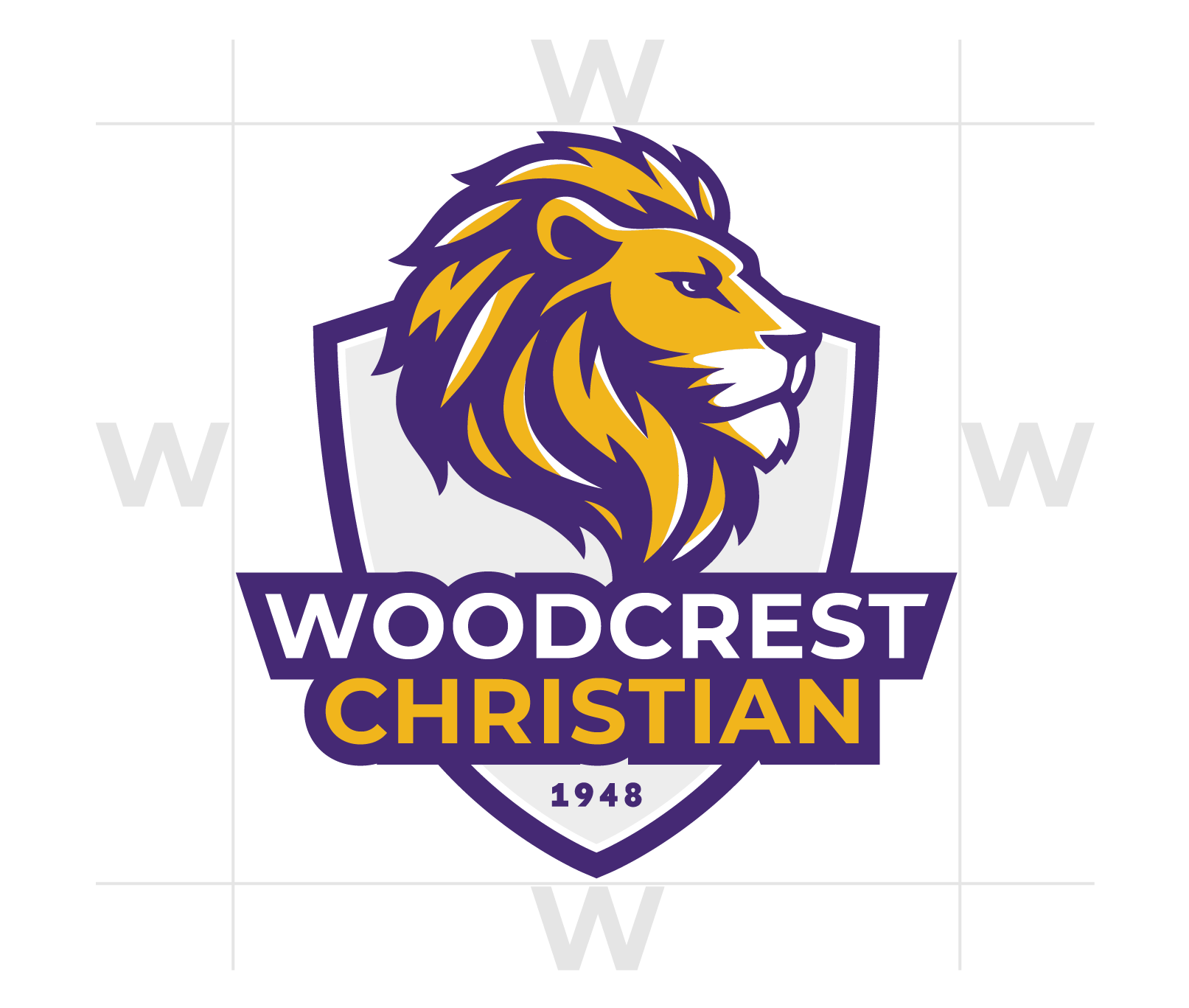
Use the size of the “W” in WOODCREST to give minimum spacing on the horizontal and vertical axis.

Use the size of the base-serif in “W” to give minimum spacing on the horizontal and vertical axis.

Use the size of the “O” in “Royals” to give minimum spacing on the horizontal and vertical axis. Exception: “WOODCREST CHRISTIAN” and sports mentions may be added within these guidelines (examples below)

To ensure legibility in printing, all logos must be reproduced at no smaller than .5 inches tall. For digital applications, ensure that logos will be legible when down scaling. For web and screen use, scale proportionally to maintain readability. Avoid reducing the logo below the minimum size, as it will compromise clarity.


Use the academic logo for school-wide and academic purposes, and the athletic logo for sports-related materials.
Include the tagline when space allows and when the audience is unfamiliar with the school. Avoid using it on small items or when legibility is an issue.
No. Always use the approved brand colors exactly as listed in this guide.
For questions about the Woodcrest Christian School brand or help selecting the correct files, contact:
Khara Dizmon
Director of Communications
mrs.dizmon@wcss.org